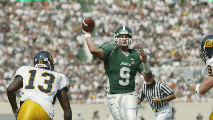
After taking a look at the best Michigan State football uniforms of all time, it’s time to do a 180 and see which jerseys didn’t pan out.
If you’re someone who follows Spartan Avenue, you probably saw my top five Spartan uniforms of all time list earlier this week. If you haven’t read that, I’d recommend reading that one either before or after you read this list. And while it’s fun to look at those, it’s a little easier to look at the ugliest uniforms and talk about what went wrong.
We still have ugliness fresh in our mind with the recent release of one of the worst uniforms in the history of college football. Fortunately, this is one of few ugly designs that Spartan fans have seen and for the most part, we’ve been happy to watch our favorite team play in the green and white year in and year out.
Generally speaking, when a bad Spartan uniform is released, the issue stands in the fact that the designers tried to get too bold. I’ll elaborate more with each specific look, but MSU has had success when sticking to toned down colors.
Two of the greatest uniforms (in my opinion) ventured out from the classic green and white and added some black, bronze and gold. Even with these risky additions, none of these colors were as extreme as a bright neon.
Michigan State is not Oregon and never will be. Neon isn’t our thing, just give it up.
