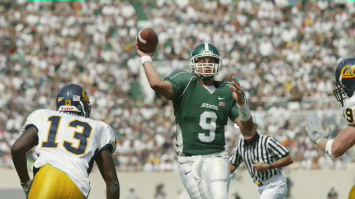
4. The 2003-06 green, white, green look
This design isn’t really terrible. They didn’t go over the top with anything and nothing immediately shocks you with how ugly it is, it’s just a lazy uniform. I know that uniform designs weren’t as flashy back then, but this might be the most boring uniform I’ve ever seen.
It looks like a high school project where the student completed it just to get participation points. It’s literally a white jersey with Times New Roman font slapped on the front and a hardly noticeable stripe on the sleeve.
This, paired with the combination of green helmets, white jerseys, and green pants, makes for a bad overall look. The green, white, green has never been a good one, even to this day. I know some people claim it’s a classic look, but it’s just an eye sore the entire game.
I blame this color combination for the loss against Northwestern in 2017.
